Content Writing & Strategy
The question a content strategist asks is: What should we create and why? The answer must incorporate logic, psychology, empathy, branding, research, design and more elements to give users what they need for the best possible experience to accomplish the business objective.
Google Retail Training
The business problem
I was brought in at Beyond Marketing for a large project for their client, Google. The client needed a series of training modules, or "classes," to help floor associates at stores like Best Buy and Walmart learn what they'd need to know about Google's products in order to sell them confidently.
The research & solutions
The challenge was to make what could be dry reading into an entertaining—yet educational—experience, with Millennial-friendly lingo and engaging quizzes, plus rewards for completing each training. Our extensive research was enhanced by a psychologist and expert in human learning. This was useful for helping us understand how to phrase information and questions for high cognitive retention. We then created supplemental one-sheets for the various products based around the classes to help keep information fresh and front of mind for the sales floor associates.
Shown below:
1. Google Retail Training Home Screen
2. Google Retail Training Quiz Question
3. Supplemental in-store product one-sheets


Stitch Fix App Downloads
Just one of many, many Product Team projects I worked on during my time as the sole UX Writer at Stitch Fix, this was a good example of how the content strategy evolved over time with research, brainstorms, copy & design iterations, creative reviews, feedback and discussions
The business problem
The Stitch Fix iOS app provides a rich, high-quality experience for clients shopping on the platform—and data suggests conversion is higher via the app. However, many active clients with an iOS device are still visiting the site through mobile web or desktop.
So, how might we bring awareness to the app in places users are likely to see it, for a timely and non-intrusive experience?
The research, testing & solutions
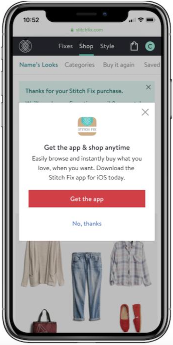
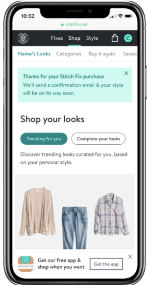
A survey found that most clients had never noticed the desktop-only app download banner, so we discussed various places for presenting the promo and landed on three options: One within the shopping experience itself (though testing then proved this to be easily missable as shoppers were absorbed in their activity). One that showed as a pop-up (users reflexively dismissed it without reading it post-checkout). And one on the purchase confirmation screen. The purchase screen promo won out—we tested several design & copy options there, including larger ad-like concepts as well as a small, simple banner. In this case, simpler was better—plus the location and timing was right.
Shown below:
1. Promo at end of product screen
2. Pop-up on purchase confirmation screen
3. Purchase confirmation screen banner