UX Copy | Content Design
Effective user experience and interface copy informs or instructs the user to help them flow through the site easily with the right words at the right time. It should be clear and concise while utilizing the brand's unique voice whenever possible.
Stitch Fix - User Acquisition
The business problem
The Stitch Fix women's landing page has to do a lot of heavy lifting quickly and succinctly—the goal is to channel external traffic into the conversion funnel via our style quiz. So the question becomes, how might we increase the likelihood that users will click into the style quiz?
The research & solutions
We learned that incoming users will grant us mere seconds to:
1. Explain how Stitch Fix works. 2. Mitigate fear. 3. Convince them to engage (and check out).
In the hero module, I provided an inspiring headline that covers the gist of how Stitch Fix works. The sub copy succinctly tells the user how we personalize looks for them. It mitigates pricing and size/fit concerns with help from imagery and text links below, as well as the common worry that it might be a subscription service. The prominent CTA is inviting, has been tested thoroughly, and has been found to be just the right wording.
Many users feel confident at this point and skip the rest of the page, diving into their style quiz. But many need more. The page incorporates information we know is reassuring for them, including the fact that our stylists are human and not only algorithms, we learn their style even better over time, and most importantly—we listen, we're here for them. That empathy for the user has been effective for conversion rates—we know that empathy is always the right path in general.
We then asked ourselves, how might we further reduce friction for starting the style quiz? The answer we came up with was to add a module at the bottom of the page to reinforce what we've covered throughout the page, this multiple choice selection is way to 'start the style quiz' right on this landing page. We tested two designs for it, with pros and cons for both. Users liked the pill format but didn't like reading so much copy. Because the point of the module was to reduce friction, we went with the simpler option 2.
Shown below:
1. Women's landing page hero
2. Landing page fear mitigation content
3. Version 1 of 'get started' module
4. Version 2 of 'get started' module

Women's landing page hero

Fear mitigation content with stylist note

Version 2 'get started' module
Women's landing page hero
More UX & UI Examples
Over the years, I've contributed to UX and UI projects for various clients. Here are just a few.

StubHub
One of the features StubHub users can enjoy is the ability to sell tickets they've purchased for events they're unable to attend. The instructions have the potential to sound complex, but I found a way to distill them down and make them easier to comprehend.
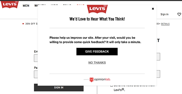
Levi's
As a Sr. Web & UX Copywriter at Oracle/Responsys, I worked with our client Levi's to create a simple feedback survey pop-up to be triggered for Levis.com shoppers after several minutes of browsing.

Ross Dress for Less
Knowing that user-generated content is a huge winner as far as user engagement, Ross Dress for Less requested a homepage module to promote their Instagram accounts. This copy is easy to absorb at a glance, it's lively and positive, and gets the relevant info across succinctly, with clear CTAs.